Tuesday, March 27, 2012
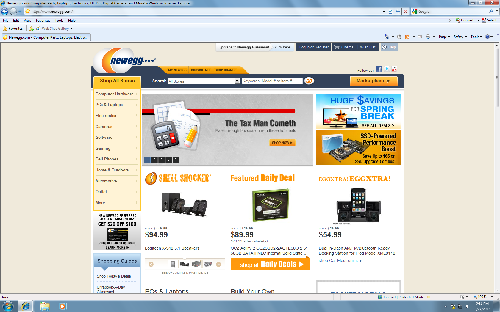
I was working on thumbnails today and looking over ideas for formats. I checked a few of my favorite websites for ideas and was looking over the newegg website. I noticed how cramped the entire site seemed. It almost looked like some type of popup ad with all the pictures and logos everywhere. I feel that if the site were cleaned up drastically it would make a big difference in the appeal to the actual site. Thing should be more easy to access and the nav bar should be horizontal instead of vertical because typically, a vertical nav bar reduces the size of the body on a page and makes the whole page more cramped to begin with.
Tuesday, March 20, 2012
First website is completely finished now. Im very happy with my outcome, but I wish I'd taken more time to work on my gallery. I can still take some time here and there to improve it before the final, but now I need to focus on photography for my next few websites.
I think Im going to take a drive down to baltimore to get some pictures of the inner harbor, I think its a good enough place that I can get a lot of good shots.
I think Im going to take a drive down to baltimore to get some pictures of the inner harbor, I think its a good enough place that I can get a lot of good shots.
Subscribe to:
Comments (Atom)