Wednesday, February 29, 2012
Been thinking over the gallery page of my site again, its going to have to be a LOT more simple than I originally thought it would be. I think Im going to keep the gallery limited to four photos wide and N long, N being however many photos fit on the page after four in each row. I took a few more pictures of the car today to use, and I was working in photo shop to try and clean them up a bit. I really need a photography class..
Learning the basics of dreamweaver on tuesday was pretty awesome, there was a lot to take in but I think I absorbed everything pretty well. I really thought it was pretty easy, but creating the CSS rules for the div tags kinda felt like a drill through my skull, seemed like so many things to remember for just a simple little thing. Although it was kinda tough to figure out how to do it right the repetitiveness helped to reinforce it. I think I need to read up a bit more on dividing the sections on the page. I think it might be kinda hard to get the actual lines on my page to show up if I'm going to be copying image sections from the actual layout that I created. Im wondering if its not possible to create actual lines, objects, on the page itself. I'll have to look into this.
Thursday, February 23, 2012
I was thinking through ideas for a gallery on my web page. I'd really like to do a sort of 'scrolling' look where if you hover the mouse, the picture will get larger. I know there are ways of doing this in HTML, but Im not sure how it would work. I think the algorithm would be something along the lines of 'mouse hover - picture.size --> *2 or something like that, just to give a better preview of the photo. It would really help in terms of enhancing my site's graphic appeal. Other ideas are a simple grid of photos, clicking one will take you to a seprate page where you'd see just the photo. Kinda like if you were to right click a picture and hit 'view image'. This idea is a much less apealing to me because of the fact that I think most people will chose this as their option.
Wednesday, February 22, 2012
My parents bought an Adobe Suite for my little brothers today. Got everything installed and it looks like now I have photoshop and illustrator here at home. I worked a bit on my SMTC website, changed a few of the headers and played with the navigation font size. I think I like those fonts all where they are now. It gives me a strong primary font for the title of the site, a secondary for the headers/nav, and a tertiary for regular text.
Yesterday I took a few pictures of my most recent modification, my S Tech lowering springs and the drop amount they gave me. I'm very pleased with the look now and I can use the photos I took for my website.
.JPG)
Yesterday I took a few pictures of my most recent modification, my S Tech lowering springs and the drop amount they gave me. I'm very pleased with the look now and I can use the photos I took for my website.
.JPG)
Friday, February 17, 2012
First project was much more successful than I'd originally hoped. I really really loved the look of the scion website that I made and just the way that it seemed to fit the theme. I think I'll most likely be using that website to continue off of. My commercial website was a success in most ways I think except that I felt it was a bit too cluttered. Perhaps if I was to make all the lines a bit thinner, it might work better. The music website was meh. I didn't like it at all.
I really think the scion website needs a lot more work on the content and the arrangement of said content on the front page but once I get a general form going for it, I think it'll be a lot better.
I really think the scion website needs a lot more work on the content and the arrangement of said content on the front page but once I get a general form going for it, I think it'll be a lot better.
Sunday, February 12, 2012
I worked a bit more on the sketch for my commercial site tonight, I'm really liking the way that its coming out so far. It has a formal look, but not intimidating like some other websites are. The home page layout is going to provide a brief idea of what the be expected from the site; new phones, plans, and recycling old phones.
There will be small Sections on the front page, I may divide it into three columns actually. The left section would be to introduce the page for new phones, middle would introduce information on cellular plans, and the right would be to promote the eco-friendly disposal of old cell phones (may or may not include a small green version of the company's logo). I may go to the college tomorrow to try and work on said logo as I've got a few ideas on paper but really want to see them drawn up online.
There will be small Sections on the front page, I may divide it into three columns actually. The left section would be to introduce the page for new phones, middle would introduce information on cellular plans, and the right would be to promote the eco-friendly disposal of old cell phones (may or may not include a small green version of the company's logo). I may go to the college tomorrow to try and work on said logo as I've got a few ideas on paper but really want to see them drawn up online.
Friday, February 10, 2012

.JPG)
.JPG)
Thursday, February 9, 2012
Spent some time working on my logo today for my hobby website, and I'm pretty sure I'm darn near done. I really like the way it came out, and how simple it was to create. I've been looking it over for a lot of the night trying to think of simple things to do to bring it together more. I may try to raise up the top corners of the underline on the far ends to match with the curvature of the S and the C.
I've also been brainstorming some ideas for the commercial logo in my mind, I really think I'd like it to be angled forward, the letters leaning top toward the end of the logo, it gives it a sort of faster feel to it, like doing business with the company will be easy and simple. Color scheme ideas still haven't changed much, I want to keep them as white and red to give the site a more aggressive look.
I've also been brainstorming some ideas for the commercial logo in my mind, I really think I'd like it to be angled forward, the letters leaning top toward the end of the logo, it gives it a sort of faster feel to it, like doing business with the company will be easy and simple. Color scheme ideas still haven't changed much, I want to keep them as white and red to give the site a more aggressive look.

Wednesday, February 8, 2012
Finished the last three thumbnails. I like how most of them turned out, some feel a little too bland and some feel like I tried too hard on them but I think thats something Im gonna have to get used to, I wanna be able to make sure Im right in the middle where I want to be and in some cases leaning toward a certain side for design purposes like creating a bland website but giving it a clean look.
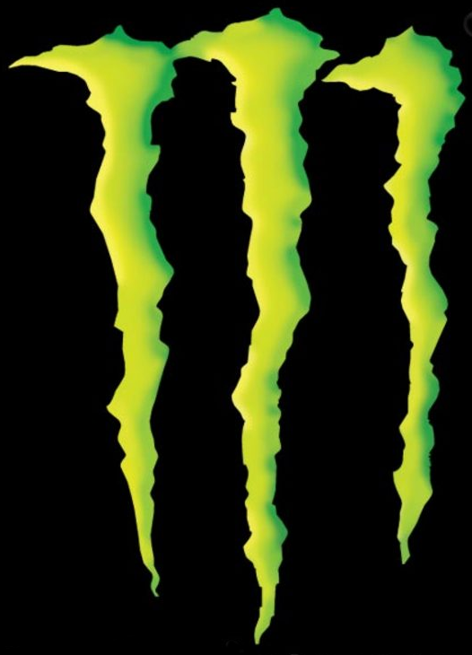
I've been contemplating the logos for each of my websites and getting a lot of ideas from watching TV or just looking at things around me. I've been pretty intrigued by the monster logo of late. I really like how it is shaped, looking like it was actually a tear from three individual claws, but also looks like an M. I think though that its a hard logo to work with because it really doesn't convey any sort of meaning. If someone were to look at the logo by itself, not knowing what Monster was, they'd have a hard time figuring it out.

I've been contemplating the logos for each of my websites and getting a lot of ideas from watching TV or just looking at things around me. I've been pretty intrigued by the monster logo of late. I really like how it is shaped, looking like it was actually a tear from three individual claws, but also looks like an M. I think though that its a hard logo to work with because it really doesn't convey any sort of meaning. If someone were to look at the logo by itself, not knowing what Monster was, they'd have a hard time figuring it out.
I started a few more thumbnails today, oriented the correct way this time. I really like one in particular that I made for the hobby website. The logo and a smaller graphic will be at the top of the page separated by a diagonal line that will lead down below the header, dividing two of the page tabs. The rest of the page tabs will have smaller diagonal lines between them, one on each side of the main diagonal.
As far as colors go, I think I want to go with a silver and black scheme with accents of white as that color scheme will match my car that I will be putting on the site.
For the front page, I want to keep the information limited, only enough to let the user know what the page is about and to pique their interest. I may put a shot of the car on the front page, very up close though. Perhaps a wide angle shot of a tail or headlight.
My cell phone page is also progressing a bit, the color scheme I'm planning to use will be white with accents of red, the text will be black. This site will be much more open on the front page, with ads for certain phones on each side as well as specials that the site is running.
Tuesday, February 7, 2012
My thumbnails are meh. I'm only really feeling a few of them. I kinda feel like they need something more graphically speaking, it could be the lack of colors and graphics in general. Either way, I wish I was more into the styling of the thumbnails in the first place, I feel like it'd make them a lot easier to draw because right now, its just getting repetitive.
I saw a few designs recently I like, but I keep having this image of a very clean website in my mind as far as what I want it to look like. The only issue is that it would require a splash screen, and I know the kinds of projects we're doing do not have any business near a splash screen.
I saw a few designs recently I like, but I keep having this image of a very clean website in my mind as far as what I want it to look like. The only issue is that it would require a splash screen, and I know the kinds of projects we're doing do not have any business near a splash screen.
Thursday, February 2, 2012
I've come up with a few ideas for my websites for this first project. The commercial website is starting to work itself out in my mind, I think Im gonna try to get a few pictures of my family's different phones. My dad is about to buy a new iPhone so I'll be able to get at least four different phone pictures, I'm also working next to a verizon store so I can get some more pictures there and they're even already displayed.
My website on hobbies is going to be about modifying my car, I feel that so far its my strongest website idea. I will be able to take pictures of my car and update the website constantly as I continue to modify. I've got four major modifications in mind that I can write about.
What I really need to think about is how I'm going to present each of my websites, I want the commercial site to look very clean as far as graphics go. I dont want to have a ton of different pictures or logos, perhaps just one is fine since I'll already be hosting a ton of pictures for each different phone. The car modification website will be more industrially designed, something that will fit a lot of the pictures I already have taken of the car.
Subscribe to:
Comments (Atom)