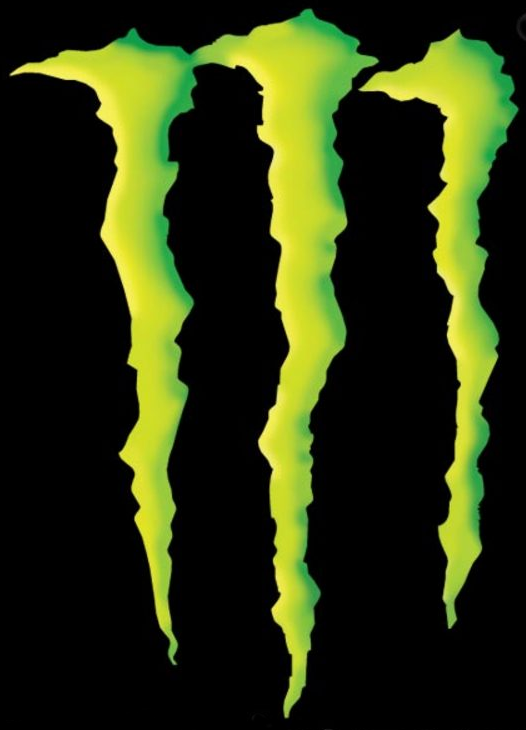
I've been contemplating the logos for each of my websites and getting a lot of ideas from watching TV or just looking at things around me. I've been pretty intrigued by the monster logo of late. I really like how it is shaped, looking like it was actually a tear from three individual claws, but also looks like an M. I think though that its a hard logo to work with because it really doesn't convey any sort of meaning. If someone were to look at the logo by itself, not knowing what Monster was, they'd have a hard time figuring it out.
No comments:
Post a Comment